
The Two X’s Problem
Why AI-designed brands feel like AI-designed brands


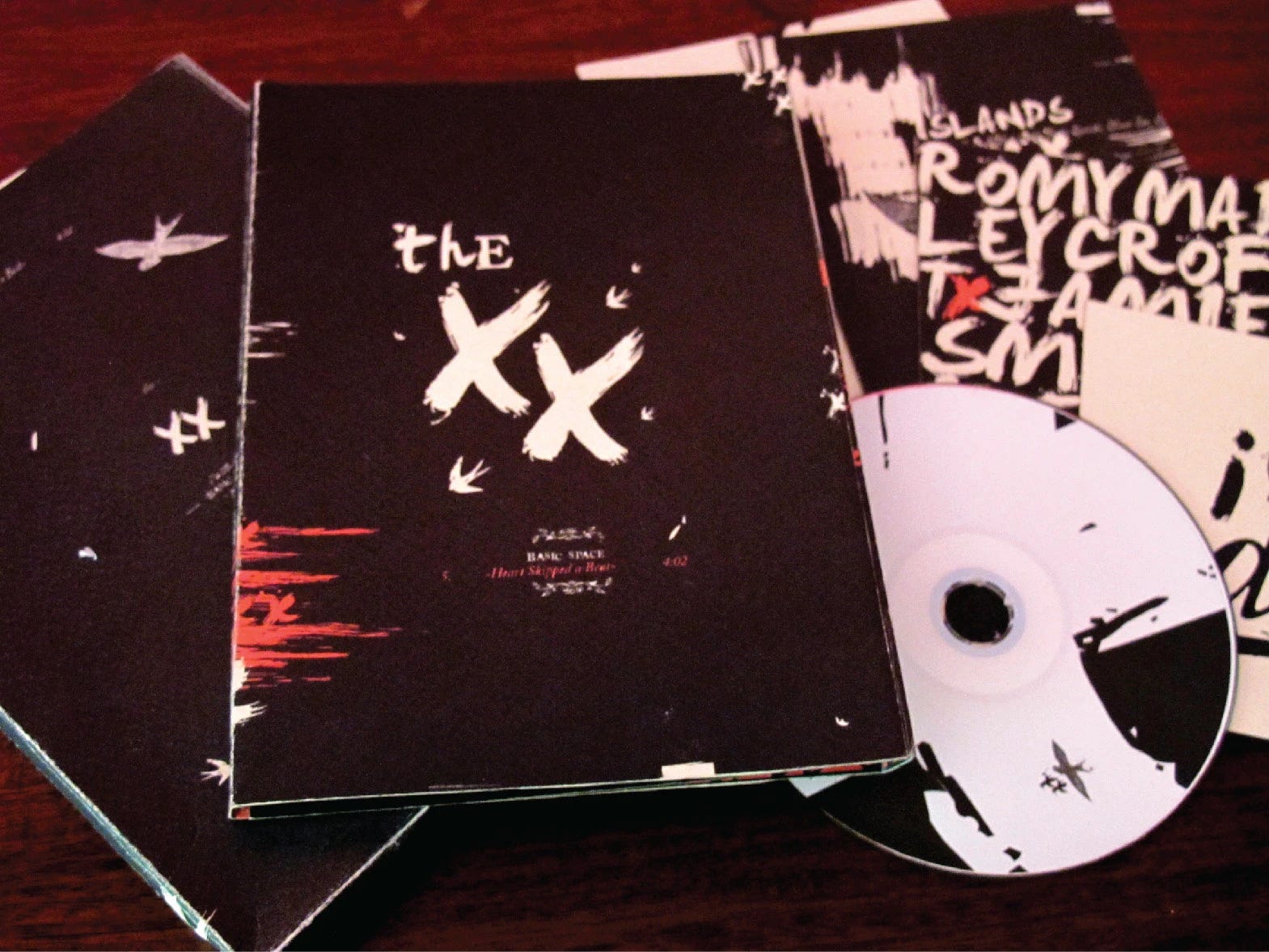
When I was studying design, I made an album cover for the band The XX as a design exercise. I picked one of their songs, found a brush-painted font on dafont (those free falopa fonts sites that were all over the internet back then), typed out the title, called it a day.
My typography teacher looked at it and told me that he felt fooled. The two X’s were identical. Of course they were. They were the same glyph in a font file. But then, the whole point of brush lettering is that every stroke should be a little different…
I have been thinking about that a lot lately.
At CodeYam, I have been working on creating multiple design systems in Claude so they can work as starting points for our users to choose from for their projects. Themes I’ve created include Minimalistic, Gummy, Ethereal, Coder, and others.
The basic idea is to feed Claude Code (or the AI agent used within CodeYam) a mood board that gives the AI some direction in order to then get back a system the user can riff on. And it works. Fast. But my feelings about the initial results are mixed.
Sometimes, Claude nails it. Sometimes, while the result is technically correct, the output feels emotionally hollow. I have been reflecting on this and trying to understand what separates the two.
What AI is genuinely great at
AI is great at creating generic artifacts. And I don’t mean that as an insult. Generic is what gets your MVP (Minimum Viable Product) out the door this week instead of the next month.
Even before AI, leveraging preexisting libraries, templates, and toolkits was a common practice to save time in design and development. Why spend time reinventing the wheel when there’s a decent enough set of components already there?
If you want a clean SaaS (Software-as-a-Service) landing page with a big Sans Serif headline, a soft gradient, and a CTA (call-to-action) button, Claude will deliver it before you finish your coffee.
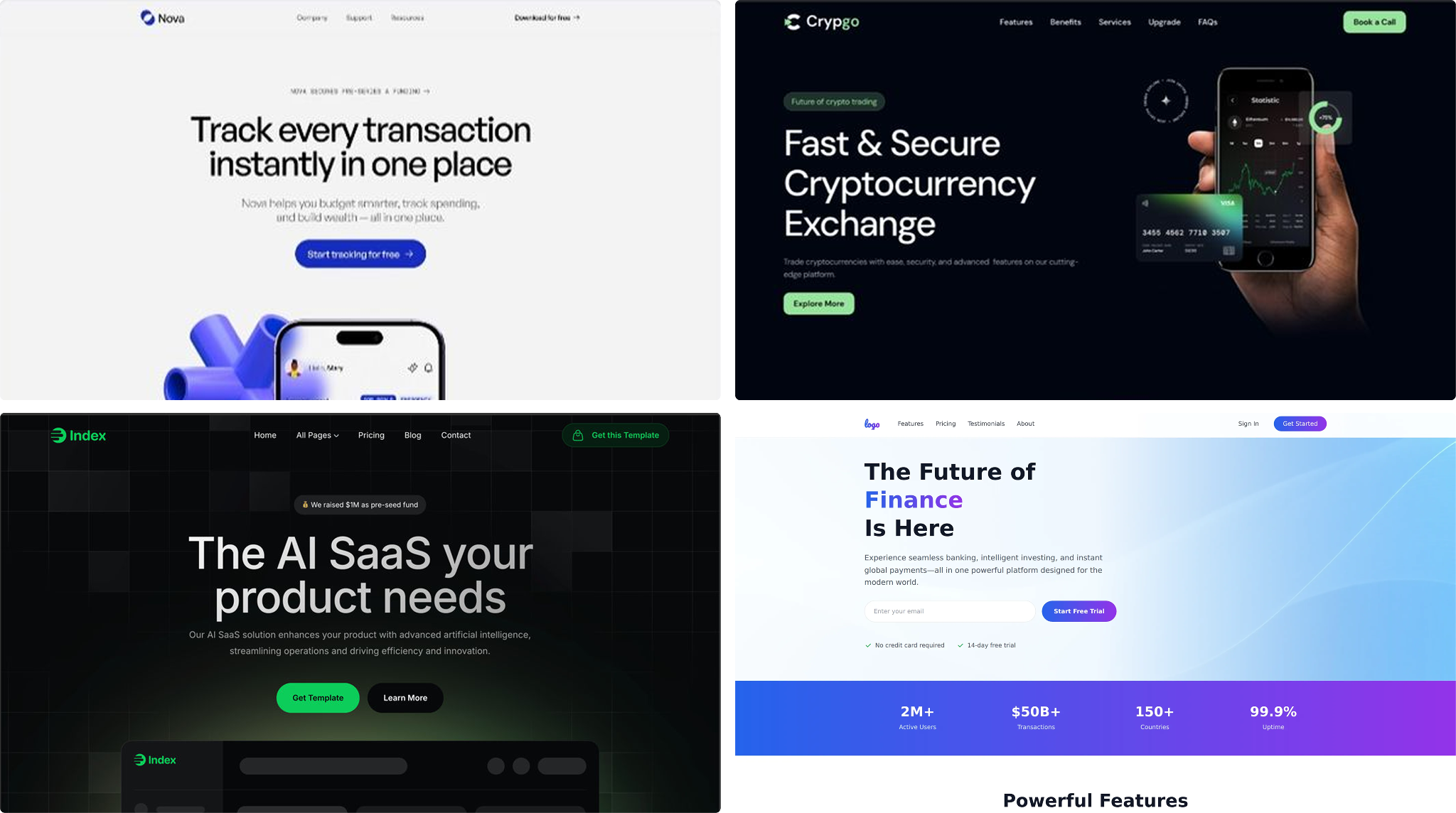
Same with generic results for verticals like fintech (deep darks, blues, sharp grids), crypto (slightly weird, gradients pretending to be holographic), dev tools (mono accents, terminal greens). The internet is full of these patterns which have influenced the data used to train large language models (LLMs) that power AIs like Claude.
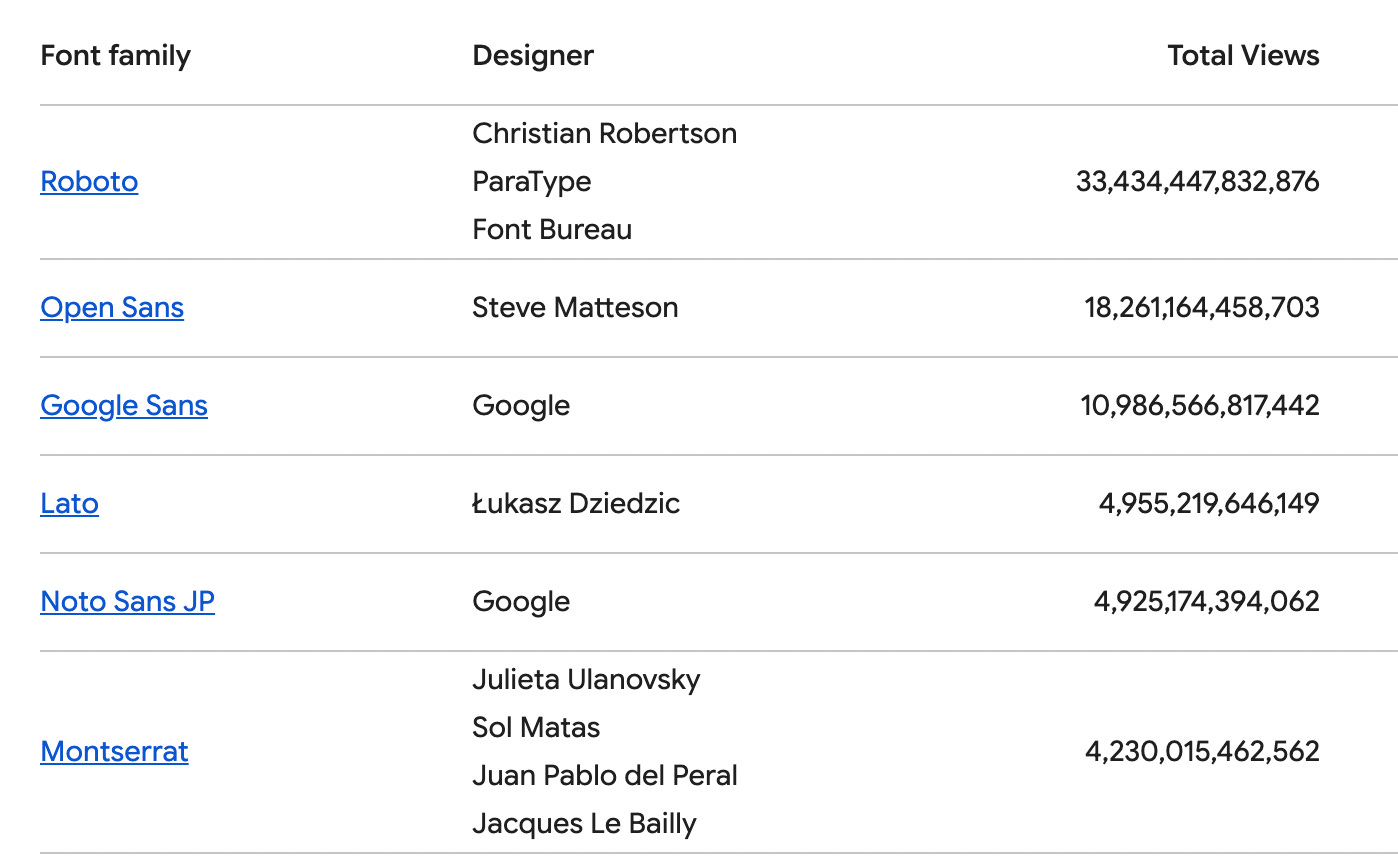
For example, I almost always see the same Google Fonts reused: Roboto, Open Sans, Lato, Inter, Montserrat, Poppins, Playfair, as well as their monospace cousins. Beautiful fonts, all of them. I love them. As a typography lover, I recognize how functional and well-made they are. But these fonts are everywhere now. There’s a reason every early-stage startup landing page is starting to look the same.
For an MVP, this is fine. Your site needs to be up and running fast.
Where it falls apart
But when you want something that stands out, that’s where everything falls apart. Instead of generic, you want unique. The weird stuff. The subtle stuff. The stuff with soul.
When I asked Claude for something more editorial, more brutalist, more illustrated, more specific to a feeling, the output got shaky. Misaligned elements. Strokes used in strange places.
Claude gave me a result that felt like the “almost there” version of something. If another designer had done it by hand, I would have thought that this was either a first step leading to something intentional and great – or a beginner’s mistake. From Claude, the results when asked for this kind of output typically land as a beginner’s mistake. And bad, lazy design.
There are a thousand quiet decisions that make a brand feel like it is saying something with value and in its own voice. Details such as the space between elements, the micro transitions, and the typography set with care instead of selected from a dropdown. Photographs with intention. Beautiful illustrations. Texture. Each of these make a difference when you’re trying to design a truly unique, and great, brand or product.
What’s actually missing
I keep going back to this: brand identity is not a logo and a font pairing. It’s a feeling, an intention, someone’s actual life and work. And conveying all this into a design system, comes from iteration, from understanding the competitors and the market, from knowing the mission of the product, from being willing to throw away three versions because none of them are right yet.
When we use AI to jump from idea to identity in one prompt, we skip exactly the part where the identity gets made. We get the artifacts of a brand without the process that produces one. And it shows.
This is the two X’s problem all over again. In design school, it was the urge to use free, readily available brush fonts. Now it’s free design systems. The shortcut looks like the work, until it starts looking like everything else.
Craftsmanship is the thing quietly getting lost in this rush. For MVPs, generic is amazing. Ship the thing. Go learn!
The proposal
For a more enduring brand identity though, you need to give the AI something closer to what you’d give a human designer.
Which means doing the work AI can’t do for you, first:
Inspiration with reasons. Say what you like about each image you share. Be specific. Notice the way the photography is cropped. The asymmetry of the layout. The font that looks hand-cut. The negative space. The transition that feels like someone breathing.
Don’t skip market research and analysis. What do your competitors look like? What pattern are you trying to break out of? “We don’t want to look like the rest of fintech” and some examples are more useful than “make it modern.”
Describe your mission and invoke feelings. Not “an app for X.” A sentence about how the product should make someone feel when they use it. “Confident. Calm. A little mischievous.” Whatever it is, name it.
Draw on specific references, especially from outside tech. awwwards, Pinterest, even other competitors’ websites are great. But also editorial design, book covers, packaging, illustration, photography, magazines, museum signage. The web is more interesting than the web you see when you’re only looking at landing pages. Now more than ever, it is time to think about the box.
Basically, build out your own branding questionnaire responses. The kind a real studio would put you through before they sketched anything. If you can answer those questions, AI output gets dramatically better.
If you can’t answer them, then no amount of prompting will save you from generic results. The gap isn’t in the model, it’s in the creative brief.
Where this leaves me (and CodeYam)
AI is incredible for getting from zero to one. It’s not yet a substitute for the part where you turn one into something that feels like yours.
At CodeYam, we’re trying to figure out where exactly that line is, and how to give people tools that respect the line and empower them to create great, unique brands and software. Generic systems can work fine for the MVP stage. But there’s a real question and real iteration at the identity stage. And maybe, eventually, AI that knows the difference between the two. But today, that requires human discernment.
Until then, I’m still thinking about my teacher and those two identical X’s. I don’t feel that I have this fully figured out yet. AI-designed things still feel a little too AI-designed. But now we know that with iteration, and with specificity, the hand can help shape a better product and a better brand. That’s a good start.
CodeYam introduces simulation to create a powerful, comprehensive AI-native software development experience for experienced developers and aspiring builders alike.
 | A guest post by
|